Quick Betimate
Popular Leagues
-
UEFA Nations League
-
England (19)
- FA Cup
- Premier League (10)
- Championship (1)
- League 1 (1)
- League 2 (1)
- National League (1)
- National League North
- National League South
- Premier League 2
- Championship Women
- Development League 2
- FA Cup Women
- FA Trophy
- FA Vase
- Isthmian Division One North
- Isthmian Division One South
- Isthmian Premier Division
- National League Cup
- Northern League Division One
- Northern Premier League
- Reserve Matches
- Southern Premier League Central
- Southern Premier League South
- Super League Women
- U21 Premier League Cup
- Northern Ireland Championship
- Northern Ireland Championship Women (1)
- Northern Ireland Cup
- Northern Ireland Intermediate Cup
- Northern Ireland League Cup Women
- Northern Ireland Play-Offs
- Northern Ireland Premier
- Northern Ireland Premier Intermediate League
- Northern Ireland Premier League Women (4)
- Northern Ireland Reserve League
- Scotland Regional Cup
- Wales League Cup Women
-
UEFA Champions League (1)
-
UEFA Europa League
-
Spain (78)
- La Liga (10)
- Segunda (11)
- Tercera Group 1 (2)
- Tercera Group 2 (2)
- Tercera Group 3
- Tercera Group 4 (1)
- Tercera Group 5 (2)
- Tercera Group 6 (1)
- Tercera Group 7 (2)
- Tercera Group 8 (1)
- Tercera Group 9 (2)
- Tercera Group 10 (2)
- Tercera Group 11 (1)
- Tercera Group 12
- Tercera Group 13 (2)
- Tercera Group 14 (2)
- Tercera Group 15 (1)
- Tercera Group 16 (2)
- Tercera Group 17 (1)
- Tercera Group 18 (2)
- Youth League
- Copa De La Reina (1)
- Copa del Rey
- Kings League - 40 mins play
- Primera Division RFEF Group 1 (10)
- Primera Division RFEF Group 2 (10)
- Primera Federacion Women
- Primera Women
- Queens League - 40 mins play
- Regional Cup
- Regional League
- Regional League Play-Offs
- Segunda Division RFEF Group 1
- Segunda Division RFEF Group 2
- Segunda Division RFEF Group 3
- Segunda Division RFEF Group 4
- Segunda Division RFEF Group 5
- Segunda Division RFEF Play-Offs
- Segunda Federacion Women
- Tercera - Play-Offs (10)
- Tercera Federacion Women
- Women Regional League
- Women Segunda Play-Offs
-
USA (853)
-
Germany (84)
- Bundesliga I
- Bundesliga II
- DFB Pokal (1)
- Regionalliga Bayern
- Regionalliga North
- Regionalliga North East
- Regionalliga South West
- Regionalliga West
- Oberliga Baden-Wuerttemberg (9)
- Oberliga Bayern North (2)
- Oberliga Bayern South
- Oberliga Bremen
- Oberliga Hamburg
- Oberliga Hessen (10)
- Oberliga Mittelrhein (8)
- Oberliga Niederrhein (9)
- Oberliga Niedersachsen
- Oberliga NOFV Nord (8)
- Oberliga NOFV Sud (8)
- Oberliga Rheinland-Pfalz/Saar (5)
- Oberliga Schleswig-Holstein
- Oberliga Westfalen (8)
- 3. Liga
- Bundesliga II Play-Offs (2)
- Bundesliga II Women
- Bundesliga Play-Offs (1)
- Bundesliga U19
- Bundesliga Women
- DFB Pokal Women
- Oberliga Play-Offs (6)
- Regionalliga Play-Offs (6)
- U19 Cup (1)
-
Italy (23)
- Serie A (10)
- Serie B (2)
- Serie C Group A
- Serie C Group B
- Serie C Group C
- Campionato Nazionale
- Campionato Primavera 1 (2)
- Campionato Primavera 2 (2)
- Serie D
- Coppa Italia
- Coppa Italia Women
- Campionato Primavera 3
- Campionato Primavera 4
- Serie A Women
- Serie B Play-Offs (1)
- Serie B Women
- Serie C Play-Offs (2)
- Serie C Super Cup
- Serie D Play-Offs (4)
- U19 League Women
-
France (5)
-
Netherlands (15)
-
Scotland (2)
-
Australia A-League (2)
-
Japan J-League (10)
-
Japan J2-League (10)
-
Indonesia Liga 1 (9)
-
Denmark Superligaen (6)
-
Israel Premier League (3)
-
Colombia Primera A (10)
-
Colombia Primera B (4)
-
Esport (7)
Other Leagues
-
Albania
-
Algeria (2)
-
Andorra (1)
-
Angola (8)
-
Argentina (98)
- Nacional B (20)
- Primera B Metropolitana (12)
- Primera C Metropolitana (14)
- Reserve League
- Cup (9)
- Torneo A (18)
- Copa Santa Fe
- Championship Women (8)
- Copa de la Liga Profesional
- Copa Santa Fe Women
- Copa Santa Fe Women - 80 mins play
- Liga Profesional (2)
- Liga Profesional Reserves (15)
- Nacional Reserve League
- Regional League
- Youth League
-
Armenia (9)
-
Aruba
-
Australia (227)
- A-League (2)
- A-League Women
- Capital Territory NPL2 (4)
- Capital Territory NPL2 U23 League
- Capital Territory Premier League (4)
- Capital Territory Premier League Women (3)
- Capital Territory Premier League Women Reserves
- Capital Territory U23 League (4)
- Cup
- Cup Qualifying
- Darwin Premier League (4)
- FFA Cup Qualifying
- New South Wales League 1 (8)
- New South Wales League 2 (7)
- New South Wales NPL Women (7)
- New South Wales NPL2 Women
- New South Wales Premier League (8)
- New South Wales U20 League (5)
- Northern NSW Division 1 (5)
- Northern NSW Premier League (6)
- Northern NSW Premier League Women (1)
- Northern NSW Reserves League (1)
- NPL Queensland (6)
- NPL Queensland U23 (5)
- NPL Queensland Women (5)
- NPL Victoria (7)
- NPL Victoria U23 (6)
- NPL Victoria Women (6)
- NSW League 1 U20 (6)
- NSW League 2 U20
- Queensland PL 2 U23
- Queensland PL U23 (6)
- Queensland Premier League (6)
- Queensland Premier League 2 (6)
- Queensland Premier League 2 Women
- Queensland Premier League 3 (7)
- Queensland Premier League 4
- Queensland Premier League Women (5)
- SA Premier League Reserves (5)
- SA Premier League Women (5)
- SA Premier League Women Reserves (4)
- South Australia Premier League (6)
- South Australia State League 1 (6)
- South Australia State League Reserves (6)
- Sunday League Premier Division
- Sunday League Premier Division Reserve
- Tasmania Championship (4)
- Tasmania Championship 1
- Tasmania Championship Women
- Tasmania NPL U21 League (2)
- Tasmania Premier League (4)
- Tasmania South Division 1
- Tasmania Super League Women (2)
- Victoria PL 1 U23 (5)
- Victoria Premier League 1 (7)
- Victoria Premier League 2
- Victoria Premier League Women
- Victoria State League 1 (4)
- Victoria State League 1 Reserves
- Victoria State League 2
- Victoria State League 2 Reserves
- WA Premier League Women (4)
- WA Premier League Women U21
- WA State Cup Women
- WA State League 1 Reserves (6)
- Western Australia Premier League (6)
- Western Australia State League 1 (6)
- Western Australia State League 1 Women
- Western Australia State League 2
- Western Australia U23 League (5)
- Australian Matches
-
Austria (52)
-
Azerbaijan (9)
-
Bahrain (6)
-
Bangladesh (5)
-
Barbados
-
Belarus (17)
-
Belgium (7)
-
Bhutan (1)
-
Bolivia (11)
-
Bosnia & Herzegovina (15)
-
Botswana (8)
-
Brazil (220)
- Serie A (11)
- Serie B (10)
- Serie C (10)
- Campeonato Amapaense
- Campeonato Baiano 2 (5)
- Campeonato Brasileiro A2 Women (8)
- Campeonato Brasileiro Serie B U20
- Campeonato Carioca A2 (6)
- Campeonato Carioca B (6)
- Campeonato Gaucho 2 (7)
- Campeonato Goiano 2 (4)
- Campeonato Maranhense
- Campeonato Mineiro 2 (6)
- Campeonato Mineiro U20 (6)
- Campeonato Paranaense 2 (5)
- Campeonato Paulista A4
- Campeonato Paulista U20 (23)
- Campeonato U20 Women
- Catarinense 2 (4)
- Copa Espirito Santo (5)
- Copa Nordeste (4)
- Copa Rio (1)
- Copa Rio Women
- Copa Verde
- Matches
- Matches Women (16)
- Paraense
- Paulista Cup (11)
- Paulista Serie B (1)
- Paulista Women (4)
- Serie A U20 (10)
- Serie A1 Women (8)
- Serie A2 Women
- Serie A3 Women
- Serie D (34)
- U20 Cup (4)
- U20 League (11)
- U20 Women Cup
- Copa do Brasil
- Women’s Friendly
-
Bulgaria (14)
-
Burkina Faso
-
Burundi
-
Cambodia
-
Cameroon (10)
-
Canada (5)
-
Chile (30)
-
China (33)
-
Colombia (22)
-
Costa Rica (2)
-
Côte d’Ivoire
-
Croatia (19)
-
Cuba
-
Cyprus (1)
-
Czech Republic (97)
-
Denmark (47)
-
Djibouti
-
Dominica (1)
-
Dominican Republic
-
Ecuador (22)
-
Egypt (19)
-
El Salvador (3)
-
Estonia (20)
-
Ethiopia (9)
-
Faroe Islands (13)
-
Fiji
-
Finland (142)
-
Gambia (3)
-
Georgia (10)
-
Ghana (9)
-
Gibraltar
-
Greece
-
Guatemala (1)
-
Haiti (8)
-
Honduras (1)
-
Hong Kong SAR China (5)
-
Hungary (15)
-
Iceland (43)
-
India (2)
-
Indonesia (9)
-
Iran (2)
-
Iraq (1)
-
Ireland (22)
- Republic of Ireland FAI Cup
- Republic of Ireland First Division (5)
- Republic of Ireland Leinster Senior League (6)
- Republic of Ireland Munster Senior Cup
- Republic of Ireland Munster Senior League
- Republic of Ireland National League Women (6)
- Republic of Ireland Premier Division (5)
- Republic of Ireland U20 League
-
Israel (4)
-
Jamaica (1)
-
Japan (76)
-
Jordan
-
Kazakhstan (11)
-
Kenya (11)
-
Kuwait (1)
-
Kyrgyzstan
-
Latvia (20)
-
Lebanon (7)
-
Liechtenstein
-
Lithuania (25)
-
Luxembourg (17)
-
Macau SAR China (2)
-
Macedonia (1)
-
Malawi (6)
-
Malaysia
-
Mali (7)
-
Malta
-
Mauritania
-
Mexico (2)
-
Moldova (1)
-
Mongolia
-
Montenegro (10)
-
Morocco (1)
-
Mozambique
-
Myanmar (Burma)
-
Namibia (1)
-
Nepal
-
New Zealand (16)
-
Nicaragua (1)
-
Niger
-
Nigeria (10)
-
Norway (87)
- Eliteserien (8)
- Division 1 (8)
- Cup
- Cup Women (4)
- Division 1 Play-Offs
- Division 1 Women (6)
- Division 2 Group 1 (7)
- Division 2 Group 2 (7)
- Division 2 Group 3
- Division 3 Group 1 (7)
- Division 3 Group 2 (7)
- Division 3 Group 3 (7)
- Division 3 Group 4 (7)
- Division 3 Group 5 (7)
- Division 3 Group 6 (7)
- Interkretsserie U19
- Toppserien Women (5)
- U19 Elite League
- Youth Cup
-
Oman
-
Panama (3)
-
Paraguay (22)
-
Peru (15)
-
Philippines
-
Poland (80)
-
Portugal (13)
-
Puerto Rico
-
Qatar (1)
-
Romania (36)
-
Russia (58)
-
Rwanda (9)
-
Saint Kitts and Nevis
-
San Marino (1)
-
Saudi Arabia (12)
-
Senegal (3)
-
Serbia (16)
-
Sierra Leone (1)
-
Singapore (6)
-
Slovakia (21)
-
Slovenia (13)
-
Solomon Islands (3)
-
South Africa (7)
-
South Korea (27)
-
Suriname
-
Sweden (106)
- Europe Friendlies (1)
- Allsvenskan Qualification
- Superettan Qualification
- 1.div Norra (8)
- Cup (7)
- 1.div Södra (8)
- 2.div Norra Götaland (7)
- 2.div Norra Svealand (7)
- 2.div Norrland (2)
- 2.div Södra Götaland (7)
- 2.div Södra Svealand (7)
- 2.div Västra Götaland (7)
- Allsvenskan (8)
- Cup Qualification
- Cup Women
- Damallsvenskan (7)
- Div 1 Relegation (8)
- Elitettan (7)
- Juniorallsvenskan (7)
- Superettan (8)
-
Switzerland (19)
-
Syria (1)
-
Taiwan
-
Tajikistan (1)
-
Tanzania (8)
-
Thailand (2)
-
Togo
-
Trinidad and Tobago (6)
-
Tunisia (16)
-
Turkey (13)
-
Uganda (1)
-
Ukraine (19)
-
United Arab Emirates (15)
-
Uruguay (25)
-
Uzbekistan (13)
-
Venezuela
-
Vietnam (15)
-
Wales
-
Zambia
-
Zimbabwe (9)
Atletico Madrid logos, where the symbol of Madrid is featured

What are the Atletico Madrid logos over time?
1903- 1911
The first design for Atletico Madrid’s badge was released in their inaugural season in 1903. It was a simple circular logo in blue and white with two letters “A” (stands for Atletico) and “U” (stands for Ursa, which was the original name of city Madrid) interlacing in the center of the logo.
In general, this first emblem was completely different from the rest of the logos of this Spanish football, in both shape, design, and color.
Atletico Madrid logo 1903
1911- 1917
The second pattern was another unique logo that stood out from the other emblems of the club. It was designed with no frame. A red and white striped flag wrapped over a brown football. On the flag, there were two letters “CA” in the left corner. This was meant to refer to Club Atletico, with the “C” in bold and wrapped around the “A”.
This logo appeared on the players’ coat of arms for six years. This was not a long time, but the red and white striped pattern has become one of the staples in their later logo designs and even on Atletico’s home kit.
Atletico Madrid logo 1911
1917- 1932
The 1917-18 season marked a twist on a new design for the emblem of Atletico that has been mainly used in the next periods and until now. It was a shield-shaped logo that was divided into two parts. The right section featured the familiar red and white striped pattern but in vertical.
In the triangle segment on the left of the logo, there was blue bold with seven white stars and the iconic symbol “the bear under the tree” of Spanish city Madrid, which is the homeland of the club.
Atletico Madrid logo 1917
1932- 1939
In this period, the emblem was basically retained from the previous stage. The slight difference was the tone of the color, which was brighter and there were more vertical stripes on the right segment of the crest. which was increased from four red stripes to six.
Atletico Madrid logo 1932
1939- 1942
In the next four years (1939-1942), Atletico witnessed a totally new logo. This change could be explained by the fact that the club were merged with the National Aviation team after the civil war in this country.
The shield was in a special that looked like an aircraft and had a red background. In the center of the logo, there were a winged gray badge with a yellow fan in the middle and a decorated golden crown with green and red gems placed above the badge.
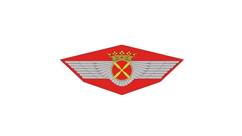
Atletico Madrid logo 1939
1942- 1947
The new logo released in this period was a combination of the two previous designs. Accordingly, there was no frame and only the large winged gray badge being featured as the base, and the shield in the 1917-1932 period once again appeared but with sharper edges. The crown was larger but its design remained. It was placed on top of the shield.
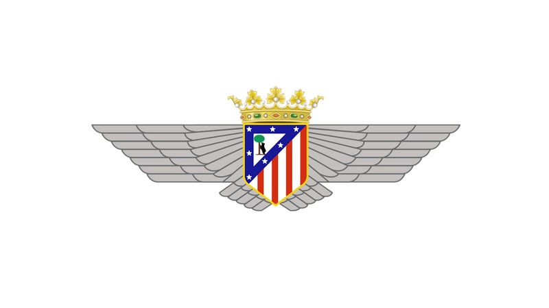
Atletico Madrid logo 1942
1947- 1950
The 1917-1932 design came back to this period because, in 1947, Atletico Madrid ended their relationship with National Aviation. However, the shape of the shield was basically changed, which was narrower and pointed in the bottom part.
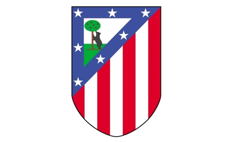
Atletico Madrid logo 1947
1950- 1970
From 1950 to 1970, the entire design of the club’s logo was adopted from the 1917-1932 period, before the Civil War. They looked the same in general, back to the round bottom. However, the color was more subtle and paler.
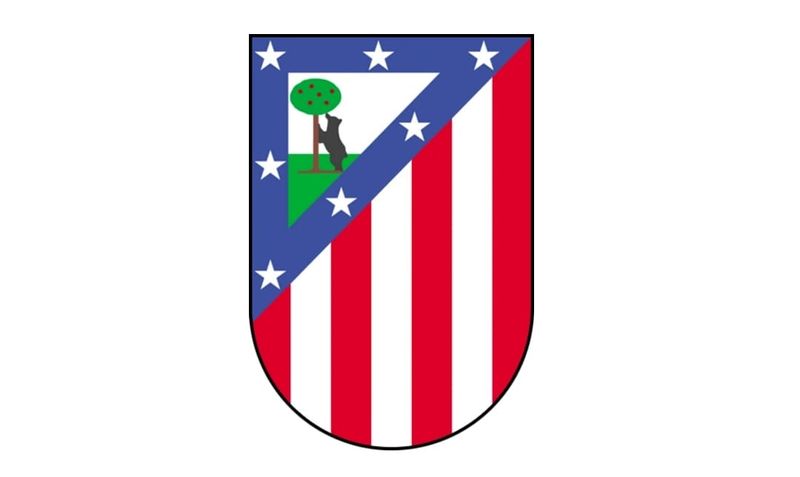
Atletico Madrid logo 1950
1970- 2016
A twist on the design of the previous emblem represented the willingness and power of the team to move forward and win. The frame was bolded in golden color and all the edges were sharper. The bottom part was pointed at this time. This was also the longest-used logo in the history of Atletico Madrid, with 46 years.
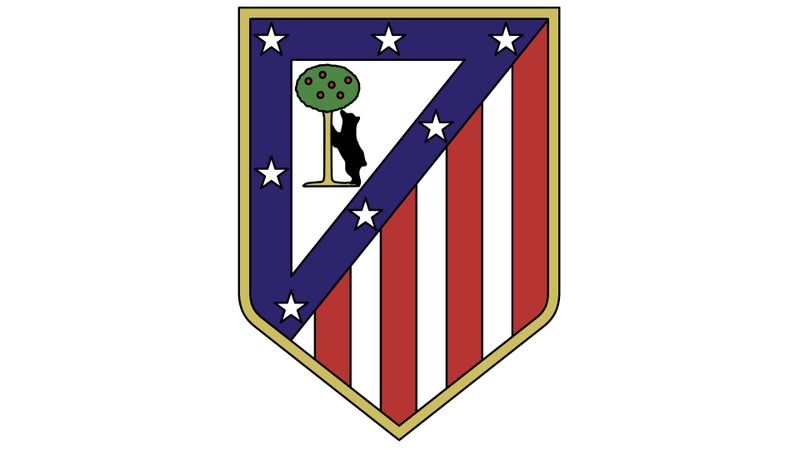
Atletico Madrid logo 1970
2016- 2017
In the 2016-17 season, the crest of the club was basically the same as in the previous stage, but the outline color was replaced by blue instead of gold. This slight change created a more balanced and professional look to the badge. The tone of all the colors was also lighter and subtle.
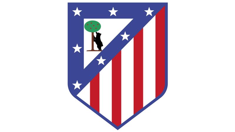
Atletico Madrid logo 2016
2017- present
The latest design that is still used in the present has the main features remaining. The symbol “the bear under the apple tree” was in the same blue color with the triangle section and the whole shield outline. The upper part of the logo is slightly arched.
The symbolic bear and tree were also placed in the opposite way compared to the last design. The bear is now standing on the left of the tree instead of on the right. The tree was not featured the whole size, but only half which gave it a stylish look.
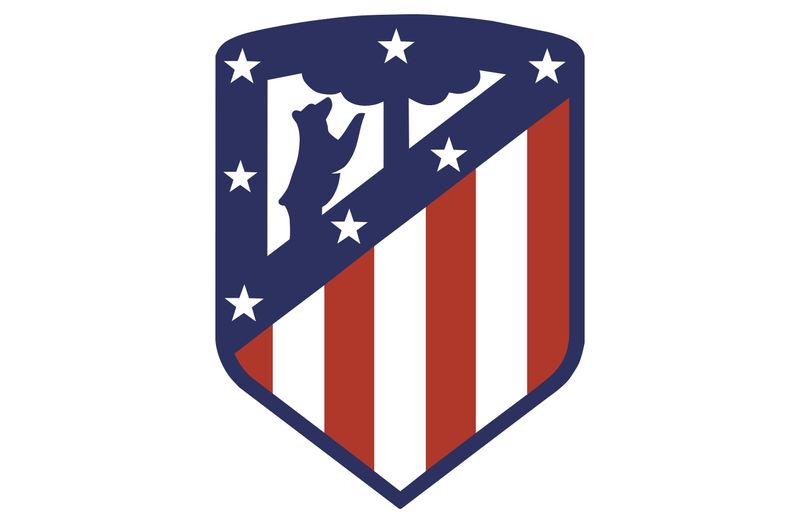
Atletico Madrid logo present
References
Wikipedia
1000logos.net

Related Content


