


By: Harry Siuu
Quick Betimate
Popular Leagues
-
 UEFA Nations League
-
England (88)
-
UEFA Champions League (3)
-
UEFA Europa League (4)
-
Spain (217)
-
USA (439)
-
Germany (149)
-
Italy (102)
-
France (62)
-
Netherlands (37)
-
Scotland (28)
-
Australia A-League (6)
-
Japan J-League (10)
-
Japan J2-League (10)
-
Indonesia Liga 1 (9)
-
Denmark Superligaen (6)
-
Israel Premier League (7)
-
Colombia Primera A (1)
-
Colombia Primera B (1)
-
Esport (186)
Other Leagues
-
Albania (4)
-
Algeria (41)
-
Andorra (7)
-
Angola (8)
-
Argentina (95)
-
Armenia (11)
-
Aruba
-
Australia (154)
-
Austria (59)
-
Azerbaijan (11)
-
Bahrain (9)
-
Bangladesh (7)
-
Barbados
-
Belarus (19)
-
Belgium (16)
-
Belize
-
Benin
-
Bhutan
-
Bolivia (11)
-
Bosnia & Herzegovina (24)
-
Botswana (8)
-
Brazil (197)
-
Bulgaria (19)
-
Burkina Faso
-
Burundi (8)
-
Cambodia (6)
-
Cameroon (8)
-
Canada (6)
-
Chile (31)
-
China (45)
-
Colombia (3)
-
Congo - Brazzaville
-
Costa Rica (6)
-
Côte d’Ivoire
-
Croatia (25)
-
Cuba
-
Cyprus (8)
-
Czech Republic (52)
-
Denmark (56)
-
Djibouti
-
Dominica
-
Dominican Republic
-
Ecuador (18)
-
Egypt (18)
-
El Salvador (7)
-
Estonia (23)
-
Ethiopia (9)
-
Faroe Islands (12)
-
Fiji
-
Finland (129)
-
Gambia (3)
-
Georgia (10)
-
Ghana (11)
-
Gibraltar (3)
-
Greece (27)
-
Guatemala (8)
-
Haiti
-
Honduras (9)
-
Hong Kong SAR China (11)
-
Hungary (16)
-
Iceland (48)
-
India (3)
-
Indonesia (12)
-
Iran (14)
-
Iraq (16)
-
Ireland (23)
-
Israel (13)
-
Jamaica (7)
-
Japan (57)
-
Jordan (8)
-
Kazakhstan (18)
-
Kenya (13)
-
Kuwait (8)
-
Kyrgyzstan
-
Latvia (11)
-
Lebanon (6)
-
Liberia
-
Liechtenstein (1)
-
Lithuania (33)
-
Luxembourg (18)
-
Macau SAR China
-
Macedonia (16)
-
Malawi (5)
-
Malaysia
-
Mali
-
Malta (5)
-
Mauritania
-
Mexico (13)
-
Moldova (6)
-
Mongolia (1)
-
Montenegro (7)
-
Morocco (9)
-
Mozambique
-
Myanmar (Burma)
-
Namibia
-
Nepal
-
New Zealand (16)
-
Nicaragua (5)
-
Niger
-
Nigeria (10)
-
Norway (102)
-
Oman (6)
-
Panama (6)
-
Paraguay (20)
-
Peru (11)
-
Philippines (1)
-
Poland (95)
-
Portugal (36)
-
Puerto Rico
-
Qatar (17)
-
Romania (66)
-
Russia (61)
-
Rwanda (14)
-
Saint Kitts and Nevis
-
San Marino (3)
-
Saudi Arabia (13)
-
Senegal
-
Serbia (18)
-
Seychelles
-
Sierra Leone
-
Singapore (5)
-
Slovakia (27)
-
Slovenia (10)
-
Solomon Islands
-
South Africa (8)
-
South Korea (32)
-
Suriname
-
Sweden (98)
-
Switzerland (32)
-
Taiwan
-
Tajikistan
-
Tanzania (3)
-
Thailand (9)
-
Togo
-
Trinidad and Tobago (6)
-
Tunisia (12)
-
Turkey (39)
-
Uganda (6)
-
Ukraine (18)
-
United Arab Emirates (9)
-
Uruguay (8)
-
Uzbekistan (13)
-
Venezuela
-
Vietnam (13)
-
Wales (1)
-
Zambia (9)
-
Zimbabwe (9)
Inter Milan logos: A new iconic logo was revealed for the new season and new era
Inter Milan are one of the oldest football clubs in Italy and within more than 100 years of history, they have changed their emblems 15 times. Betimate takes a look and will delve into each badge of Inter Milan over time in this article.

Inter Milan logos over time
The logo of a football club has never been underestimated because it partially tells the world about the club through some iconic and meaningful symbols. It is also true to Football Club Internazionale Milano, or simply known as Inter Milan. Now, let’s see how their logos look in each period of time since the inception of the club.
1908-1928
Inter Milan’s first emblem was launched in 1908, the inaugural season when the club was founded. It was a round medallion with a serene gold backdrop and a black and blue double-thick outline. On a gold backdrop, there was the elegant and powerful “IMFC” monogram in white, which stood for Inter Milan Football Club.

1908 Inter Milan logo
1928-1929
After 20 years with the first design, the club had their logo changed within only one season 1928-1929 with a totally different approach to design. It was a circular badge separated vertically by a broad gold column. A smaller crest with a green snake and a silver crown was on the left, while a sharp shining ax and a crest with a Red Cross were on the right. It was a badge made up of Milan heraldic emblems that spawned a slew of subsequent logos between the 1960s and 1980s.

1928 Inter Milan logo
1929-1931
Another design, with a geometric pattern and strong color contrast, was utilized in the 1929 logo and stayed with the club until 1931. The new emblem likewise has a rounded form, which is the only thing it has in common with earlier iterations. The emblem's rhomboid crest was colored blue with black vertical stripes highlighted in gold, and the figure's frame was divided into eight black and white pieces. The letters "A" and "S" were gold on two whites. On the bottom half of the circle, a black horizontal banner with a gold “Ambrosiana” wordmark was placed, meaning Milanese in Italian.

1929 Inter Milan logo
1931-1945
In 1931, the logo's main form changed from circle to rhombus, although the striped blue and black motifs from the previous iteration remain. All of the writing was now situated on the frame, along the badge's borders, and a light beige or gold football was put in the middle of the symbol. “Associaz Sportiva Ambrosiana Inter” was written in gold sans-serif on the inscription.

1931 Inter Milan logo
1945-1960
The club reintroduced its original symbol in 1945, drawing it in reverse colors, with the black and blue frame remaining, but the inner circle becoming white and the famous entwined monogram becoming bright gold. Inter Milan used this version of the logo for fifteen years.

1945 Inter Milan logo
1960-1961
The 1960 design included a conventional crest that was vertically split into two equal halves, one in blue and black and the other in white with a blue snake and a gold football picture on it.

1960 Inter Milan logo
1961-1963
The 1961 version of the symbol had a blue and burgundy vertically striped oval with a gold snake in the center and the “Inter” inscription on the horizontal banner on the upper half of the badge. In 1962, the oval was moved to a crest and its colors were altered to blue and black.

1961 Inter Milan logo
1963-1966
In 1963, the circular medallion with the monogram was reintroduced in its original color scheme, but with a new variation. The tranquil beige-gold of the second form of the emblem was replaced with a vibrant yellow.

1963 Inter Milan logo
1966-1978
The letters were changed from a sophisticated sans-serif style to a crisp and sleek serif typeface in 1966, and the colors of the insignia were improved, making it more pleasant and airy.

1966 Inter Milan logo
1978-1988
The club adopted the new design idea in 1978. A white snake was put in the midst of the original rigid crest, which had a diagonal pattern of white, blue, and black stripes. The gold five-pointed Star was positioned on the badge's top-left white section. A logo with the black uppercase “Inter” lettering on the upper portion of the shield was also available during this period.

1978 Inter Milan logo
1988-1998
The original logo reappears in 1988 as part of the club's visual identity, somewhat revised and with text in a strong serif typeface. The gold five-pointed Star was now positioned above the circle, and the entire artwork was occasionally encased in an oval frame and put on a striped blue and black backdrop.

1988 Inter Milan logo
1998-2007
The gold monogram was put on a black backdrop and placed inside a larger blue circle with the white “Inter” letters arched on the top and the “1908” datemark at the bottom in the 1988 makeover.

1998 Inter Milan logo
2007-2014
With the beige-gold interior circle and a star, white writing, and black and blue frame, the logo from 1966 came back in a fresh color scheme. The medallion was surrounded with a thin gold line and extra writing was put around the badge's circumference for the Inter Milan club's 100th anniversary.

2007 Inter Milan logo
2014-2021
The current version of the Italian football club's logo was released in 2014, and it incorporated the original design with improved and reinforced outlines. The ornate text is written in white on a sand-gold circle, which is encased in a triple black, blue, and gold frame in an art-deco manner.

2014 Inter Milan logo
Present
In the late 2020-21 season, a new logo of Inter Milan was revealed. The new logo was designed by graphic design studio Bureau Borsche. The letters F, C which stands for Football Club were removed as an effort to promote the club as an iconic symbol for sports in general, beyond football. This version was also simplified by the change in color, with three basic colors: black, white, and blue. This modern and elegant design is supposed to go global and reach all ages.

Current Inter Milan logo
References
Wikipedia
1000logos.net

Related Content

Chengdu Rongcheng vs Shanghai Shenhua Prediction, Odds & Betting Tips 05/02/2025
[China Super League Prediction] Who will reign supreme in the Chengdu Rongcheng vs Shanghai Shenhua showdown?
Our prediction analysts provide betting tips and current odds for this highly anticipated match.

Ulsan Hyundai vs Gwangju FC Prediction, Odds & Betting Tips 05/02/2025
[South Korea K League 1 Prediction] Who will reign supreme in the Ulsan Hyundai vs Gwangju FC showdown?
Our prediction analysts provide betting tips and current odds for this highly anticipated match.
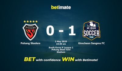
Pohang Steelers vs Gimcheon Sangmu FC Prediction, Odds & Betting Tips 05/02/2025
[South Korea K League 1 Prediction] Who will reign supreme in the Pohang Steelers vs Gimcheon Sangmu FC showdown?
Our prediction analysts provide betting tips and current odds for this highly anticipated match.
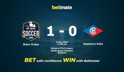
Botev Vratsa vs Septemvri Sofia Prediction, Odds & Betting Tips 05/02/2025
[Bulgaria First League Prediction] Who will reign supreme in the Botev Vratsa vs Septemvri Sofia showdown?
Our prediction analysts provide betting tips and current odds for this highly anticipated match.
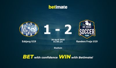
Esbjerg U19 vs Randers Freja U19 Prediction, Odds & Betting Tips 04/30/2025
[Denmark U19 League Prediction] Who will reign supreme in the Esbjerg U19 vs Randers Freja U19 showdown?
Our prediction analysts provide betting tips and current odds for this highly anticipated match.